

It’s Back to School Season and once every one gets settled into their routines post Summer time freedom, we tend to turn our attention back to home decor.
Some bloggers and instagrammers/pinterest-ers (word?) are full blown into Fall decor and I can’t blame them really.
The fall seasonal decor time frame gets chewed up quick with the early onset of Christmas in the stores, and if you want to enjoy the Fall decor you got get in now.
Unfortunately here in the South it’s still hotter than blazes and I find it difficult to think about all things fall and trendy. Currently my fall decor is going to consist of letting my plants on the front porch die and then voila - dried everything. Just kidding, kind of… so instead of jumping into Fall right away I’m going to give it a few weeks if you don’t mind. I’ll get there…just not today. :)
As I’ve been flipping my favorite magazines and online forums, I’ve seen a bit of pushback on the whites, off whites and traditional neutrals. It seems we are all craving a bit of color in our spaces and there’s not a thing wrong with that in my opinion. Of course depending on your style, you don’t want to go crazy with all the paint, but maybe some pops of color here or there would brighten the mood, or even bring in some of the fall colors y’all are wanting!
So here’s some insider tips on getting some color added into what might be a more neutral decor.
Start with something small.
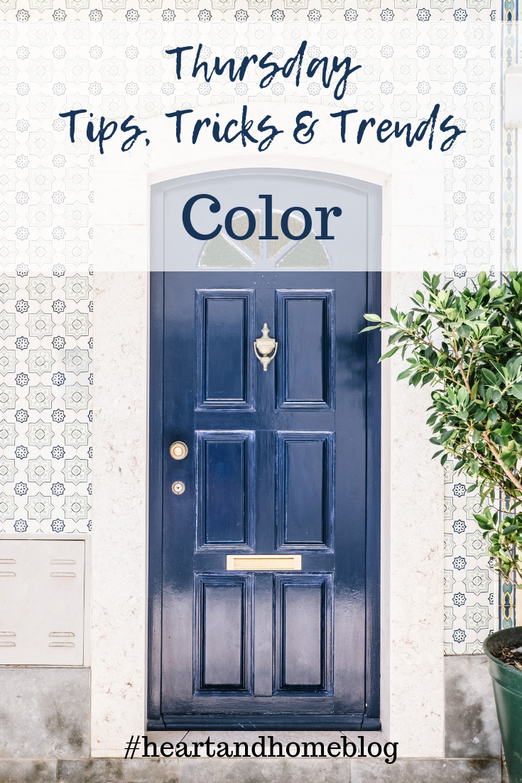
Sure sometimes the bold move is the fun move - splash that paint around and have some fun! But not all of us can make the bold moves - either the family might disown you or there’s no money in the budget for a whole room remodel. Paint a door, or one piece of furniture like a chair/small desk etc and let it be the showy accent piece.
Think bold and primary.
We want impact sometimes but we play it safe. Sometimes a piece with punch adds a wow factor we can’t get from a more muted color. If you are wanting to add a splash, consider the oomph a primary color will grant when you paint that door, or small item. Many of us are loving the bold blues popping up in kitchens lately! The blue that is the most attention grabbing is usually a bold choice, and brings a lot of style to a previously more sedate kitchen. I personally love the blues from Benjamin Moore like Blue Eyes, or Farrow & Ball Hague Blue. Remember too that these colors will vary from the can/sample based on the light in the room so be sure to test it first if you are going to paint a larger area like kitchen cabinets.
Test out your color goals in a less used space.
Maybe a guest room, front entrance, or stairs can get a trial run of your pop of color desires. If you still love it then it’s a safe bet to use the color combo or single pops in more areas of your home. If your family comments and enjoys the lift that color adds to a space, you know again that you are on the right track and can spread the color through more areas of your home.
What tips do you have for adding color to your spaces? Share in the comments!